
18 Calming Neutral Bedroom Color Palettes You Love
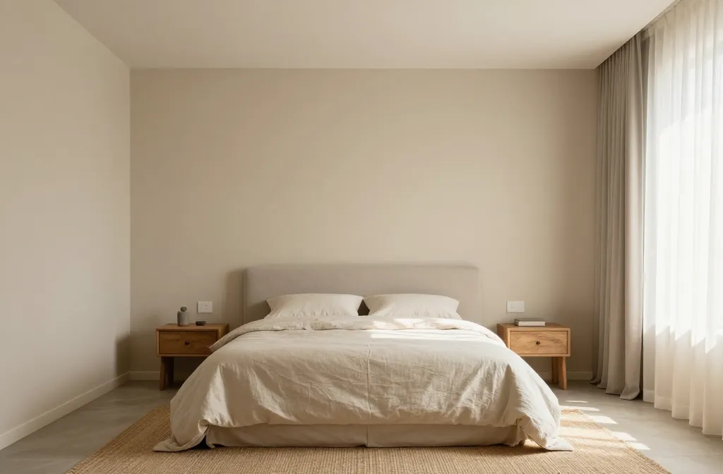
The moment you step into a bedroom, you want calm to greet you, not a loud color shouting for attention. Neutral palettes whisper, not shout, and somehow make sleep feel easier. Let’s dive into 18 calming neutral bedroom color palettes that actually work in real life—no drama, just serene vibes.
Soft neutrals that feel like a sigh
Who knew a handful of tones could feel like a deep breath? These color choices bring instant calm without looking boring. Think warm beiges, dusty creams, and gentle greiges that lean cozy, not clinical.
- Warm beige walls paired with ivory trim
- Stone gray accents with soft white ceilings
- Creamy off-whites that read almost peach in the morning light
Greige that stops traffic (in a good way)
Greige is the chameleon of neutrals. It blends warmth and coolness without favoring either side too hard. The trick is dialing the undertone so the room stays balanced, not bland.
- Greige walls with warm wood furniture
- Cool gray sheets against a warmer greige wall
- Greige textiles—curtains, rugs, and throw blankets—for cohesion
Earthy tones that ground the space
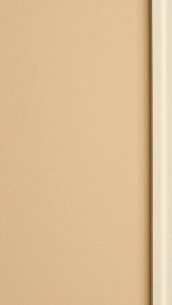
If you crave something grounding but not heavy, look to earthy neutrals. Think sandy browns, taupes, and clay-inspired hues. These palettes pair nicely with organic textures.
- Taupe walls with sandstone accents
- Clay pillow tones on a neutral bed
- Natural wood floors to reinforce the earthy vibe
Whites that aren’t stark—soft and inviting
White rooms don’t have to feel cold. The right white carries warmth, depth, and a touch of personality. It’s all about the undertone and the materials you pair with it.
- Eggshell white with linen textiles
- Ivory walls + warm brass hardware
- Pure white trim with a slightly creamy wall
Cool, calm, collected blues and greens
Neutrals don’t have to mean boring. A touch of blue or green in a muted shade can feel incredibly serene, like you’ve bottled a quiet lake or a forest morning.
Blue-leaning neutrals
- Powdery blue-gray walls with white ceilings
- Navy accents used sparingly to avoid overwhelming the space
- Blue-gray bedding that ties the room together
Soft sage and seafoam
- Sage textiles layered with warm browns
- Seafoam cushions against a light taupe backdrop
- Wooden nightstands to ground the color
Texture as color’s best friend

Color isn’t the only trick. Texture creates depth and interest without changing the palette. A mix of materials can make a neutral room feel layered and intentional.
- Velvet pillows for subtle luxury
- Rattan lamps and woven headboards for warmth
- Natural fiber rugs to soften underfoot
Lighting: the unsung hero of neutral palettes
Great lighting can transform a color story. The right light makes neutrals glow, while poor lighting can make them look dull or muddy.
Natural light wins
Let the sun in whenever you can. It brings out the true warmth of your neutrals and keeps the space feeling alive.
Layered lighting strategy
Combine ambient, task, and accent lighting. A warm bulb (around 2700–3000K) makes neutrals feel cozy rather than clinical. FYI, dimmers are your friend here.
Practical tips for choosing your palette
Now that you have a menu of neutrals, how do you actually pick? Here are quick, do-this-now steps.
- Start with a favorite neutral swatch and build around it
- Test large samples on walls to see how light changes things
- Pull 2–3 textures into the room to avoid flatness
- Think about maintenance: lighter neutrals show dust more—plan accordingly
How to use these palettes in real rooms

Sometimes a color chart can feel theoretical. Here’s how these palettes translate to actual bedrooms.
- Bedroom A: Warm beige walls, white bedding, and oak furniture. Clean, cozy, timeless.
- Bedroom B: Greige walls, ivory textiles, and a jolt of black metal in lighting. Edgy yet calm.
- Bedroom C: Sage accents, cream walls, and natural fiber rug. A touch of nature indoors.
Tips for keeping a neutral bedroom lively
Neutral doesn’t have to mean boring. Use these ideas to keep the space feeling fresh.
- Introduce one statement piece in a subtle color
- Layer different textiles with varying textures
- Use plants to bring in a dash of life without breaking the palette
Subtle pops that work in 0 effort
Think a single blanket, a vase, or a throw pillow in a slightly bolder neutral tone. It gives your eyes somewhere to land without shouting, “look at me.”
FAQ
Are neutral palettes less likely to clash with furniture?
Totally. Neutrals act like a blank stage where your furniture can shine without competing against wild wall colors. If a piece feels loud, pair it with a softer backdrop and watch harmony happen.
What about wallpapers in a neutral room?
Yes, but choose patterns that stay subtle and avoid high-contrast prints. A micro-pattern or tonal stripes add depth without stealing the calm from the room.
How do I keep a neutral room feeling modern?
Upgrade with contemporary hardware, clean lines, and a few current textures (think velvet, boucle, or metal). Pair them with updated lighting and a simple, balanced layout.
Can neutrals feel too sacred for a cozy vibe?
Not if you layer textures and warmth. Wool throws, linen sheets, and wood furniture keep the space inviting rather than austere.
Is it okay to use bold accents in a neutral room?
Definitely. Just limit the bold to a few carefully chosen elements—one rug, one artwork, and one accent piece. FYI, a little goes a long way here.
Conclusion
Neutral colors aren’t boring; they’re a playground for texture, light, and personality. Choose a palette that feels like a soft exhale, then layer in texture, warmth, and subtle contrasts. Your brain will thank you at 2 a.m., and your sleep will probably improve because the room isn’t yelling at you for attention. Ready to pick your favorite 18-caliber calming neutrals and start decorating? IMO you are.